Round Mountain Road

On Round Mountain Road in 1986

Thinking about the “why” of the years I invested a great deal of my time, energy, and resources into making photographs, I find myself wondering about what I really wanted to get out of pictures. In the beginning, I think, I was trying to figure out what I thought about the landscape around me.  It felt to me as if I was sleepwalking. It was simply there, and it seemed like it always had been there— and it was strange. Or, perhaps better— I was estranged from it.

My family moved to Bakersfield in March of 1963. I turned five years old that year, and we moved into a house on Melody Lane, next to the runway at the airport. By September, we moved to a new tract house on the west side of Highway 99, but my father spent most of his time in the oilfields up on Round Mountain Road.

Looking it up on Google Streetview, it looks different. On the driveway side, there was chain link fencing and tall climbing rosebushes, as well as a row of oleander bushes that went all the way back separating the houses. There was no fence and no palm trees on the other side. We were friends with the neighbors, the LaFoys— he worked in the oilfields with my dad.

It was hot in Bakersfield, so hot that it was painful to walk on the street in bare feet. My brother was walking home from Norris School and strayed off the street to walk in an irrigation ditch with a little water in it because it was cooler. He stepped on a broken coke bottle and collapsed. He severed an artery and was bleeding profusely. A local family saw him and put him in their pick-up and brought him to our driveway. My mother was understandably panicked, and called my dad in the oilfields to come home. They drove Stephen to the emergency room, and my dad took me with him when he left from there to go back to work in the oilfields on Round Mountain Road while they stitched my brother up. I remember having a good time playing in the shack he worked from, maintaining steam injection oil wells. I have a vague memory of him hosing down the driveway when we got home, washing the blood down the driveway into the gutter in front of the house.

Pumping units on Round Mountain Road

I have a lot of memories set in the oilfields. When someone in Oildale decided they needed my cameras more than I did and broke into my apartment there in 1982, I was forced to move in with my brother Stephen in a Tenneco Oil lease house on the western end of these fields. Because of strike activity, I had to check in with a security guard before driving up the non public roads. Round Mountain Road is public, though, and gives expansive and otherworldly views of the ancient sea floor that is the basis of this corner of the valley.

[metaslider id=3011]

My friend Slim often said that what made the valley special was the dirt. Near where these photos were taken, there’s an archeological dig at where the locals call Sharktooth Hill. Millions of sharks teeth have been dug out of these hillsides, once around 200 feet underwater in an inland sea. In a sense, when you stand there you are on a killing field where whales were being devoured by sharks. Even the megalodon swam here. Though I have so many memories of this place, it never seemed “right” to me. There is a coldness to my relationship with these fields, and I think that’s a big reason why I always wanted to drive back from time to time to test and see if my feelings had changed. I think from the moment I arrived here, I could think of very little beyond leaving.

There is a long tradition of connecting memory with the senses, with vision, with smell, and with taste. This has never been relevant to my experience. If pressed, I can smell the oil tar baking in the sun, or the chemical stench of the pesticides constantly sprayed on the fields and hills. But for me, I think it always comes down to touch— but a special sort of touch— the touch of the somnambulist.

When I wake up in the night, I generally try not to open my eyes when visiting the bathroom down the hall. It’s never a problem really, I can feel the space around me and negotiate it without walking into things. If I am uncertain, I reach out my hand or foot to touch something. Even when I’m on the road and in an unfamiliar room, it takes little time to become accustomed to the layout and be confident navigating it with minimal interaction. Bakersfield was always like that to me. I could just feel it, and move through it without touching it or it touching me very much. It’s as if I spent 32 years of my life sleepwalking there, and because of that it will always be a special place. The dirt never washes off, really— so you try not to touch too much.

[metaslider id=3038]

I remember getting really irritated once when a well meaning viewer looked at one of my photographs of a musician and said “but I can’t really hear the music.” I never wanted anyone to smell the dirt, or hear the music, or much of anything else with a two dimensional photograph. I suppose all I ever wanted to do was give someone (myself mostly) the chance to revisit the feeling of what it felt like to be somewhere else or give them the chance to trace the contours of a hole that’s been left behind. Witnessing so many musical performances over the years, I think the thing that I usually remember the most is that feeling of almost lurching forward when the music ends because a majestic thing that has once filled the room is suddenly gone. You feel yourself lurching forward into the vacuum left by an absence.

Turning the page often feels like that to me.

Gas Station Asses

In the back of a Hudson Gasoline station, Uninon Avenue, Bakersfield CA

He got a hot rod ford and a two dollar bill
looking for a spot right over the hill
where the engines roar with the smell of gasoline

[Gasoline by Slim the Drifter]


My father-in-law once asked me:”why do you love to photograph gas station asses so much?” To be honest, I didn’t really have a reply. Looking back over decades of making pictures, I can indeed verify that I have photographed many gas station asses over the years. My first exposure to the aesthetics of gasoline stations was a book by Ed Ruscha called Twentysix Gasoline Stations. Thanks to Harry Wilson, a photography instructor at Bakersfield Community College, the reserved reading section had it and several other books by Ruscha– including the infamous fold out, Every Building on the Sunset Strip.

I first saw the books in 1977, but long after I dropped out of college, I continued to go back and look at the reserved books in the library to refresh myself, and I continued to check in with Harry for years after taking his classes. Around the same time, my high school photography instructor Chris Burnett took a sabbatical to complete his MFA at California State College (soon to be California State University at Bakersfield). In the mid eighties, it hosted a wide variety of up and coming artists of a particularly conceptual variety, and Lewis Baltz’s New Industrial Parks Near Irvine was another book I viewed often, and repeatedly as well after seeing his work at Cal State. I think what drew me at the time wasn’t the intellectual side, but the visual elements that were so near to my daily experience of the world living in the Southern San Joaquin Valley; it seemed to me a way of making sense of the landscape in isolated rectangles.

It’s amazing how living long enough makes you aware (retrospectively) of details that feed your own conception of a life narrative. These pictures were “true” to me in a way that the dominant California school (Ansel Adams, Edward Weston, et. al.) were not. I loved modernist photography as I got started, but it was like visiting a foreign country– attractive but strange. A transcript of an interview with Lewis Baltz sounds like something I would say, but I haven’t read it until today:

MR. WITKOVSKY:  What changed when it became your work?  I suppose everything changed, but do you feel that the subject matter changed more, or was it an approach to how you make a picture or how you make a print?

MR. BALTZ:  It was about subject matter.  Photography had a very rigid hierarchy of subject matter, very much like the 19th-century French salons.  If you look at photography from the ’50s, even in the ’60s, and you begin to think about all the things in the world that were not photographed, were not even acknowledged, [it] was staggering.  The list goes on forever.

It dawned on me when I was living in Monterrey that serious photographers – the Edward Westons, the Wynn Bullocks and the Ansel Adamses, would go to some special, privileged “natural” place to work.  It was an article of faith – in this case the faith of American Transcendentalism – that to commune with nature was the sign of A Great Soul, no amount of the evidence to the contrary withstanding.  The corollary of that attitude was that the rest of the time – when not in the privileged world of pure nature – one might as well be dead to the world.

Unfortunately, my life very rarely involved going to Yosemite [National Park, CA].  My life was about going to shopping centers, being in a town, an urban situation, which seemed to me was also a landscape but one that no one had any interest in looking at.  But I was interested in looking at it.

[Oral history interview with Lewis Baltz, 2009 November 15-17]

Another aspect of the New Topographics photographers like Baltz and artists like Ed Ruscha that mattered to me was that they had a sense of humor completely lacking in “art” photography. It might be deadpan, but there is a humor to digging through the world’s rubbish. I disliked some often included in the group (like Robert Adams) because they seemed too judgmental. I just wanted to make sense of the things that were there, not pass judgment on them. They were beautiful to me.

[metaslider id=2939]

I don’t usually remember to photograph anything that might actually identify the place, or the moment in time, but in the case of a group of pictures I recently unearthed it wasn’t too difficult to track down some interesting details. Sometime in 1982 or 1983, a new capacious gas station opened up on Union Avenue in Bakersfield, California.

From the sign, it’s clear that this is a Hudson gas station. The striking feature was an array of billboards that reminded me a lot of Soviet propaganda, proclaiming its mastery through its presence in 36 states, from coast to coast.

[metaslider id=2929]

There is a story to be found about this particular chain. Most of the press from a few years later lists them as having stations in 34 states, but it seems that inflating numbers is nothing new for this company. From August 11, 1983:

One of the nation’s wealthiest women–and the only woman to head an American oil company–has been fined $500 and sentenced to 200 hours of public-service work for personally ordering the rigging of gasoline pumps to shortchange customers.The sentencing of Mary Hudson Vandegrift came Tuesday in an Olathe, Kan., circuit court after the 70-year-old chairman of the board of Hudson Oil Co. pleaded no contest to the felony-theft charge. She also was sentenced to two years’ probation. She could have been sentenced to up to five years in jail.

Vandegrift, of Mission Hills, Kan., was listed last year by Forbes Magazine as one of the nation’s 400 wealthiest individuals.Court records said Vandegrift ordered one of her Kansas-area marketing managers, Robert Monroe Neuffer, to break the state seals on pumps and then readjust the pumps so that customers received eight to nine cubic inches less than they deserved on a five-gallon purchase.

[Washington Post]

A Kansas City history web site lists the number as 35 states, and suggests that Mary Hudson, a  “vinegar and velvet” woman was considered a role model by many. In fact, I found a reference to this short-change artist on a motivational speaker’s web site:

But don’t be overly influenced by negative thinkers. Just take their viewpoints into consideration. There’s a famous story of Mary Hudson, who started off with 200 dollars in the middle of the Depression and leased a gas station that two men had gone broke running at two different occasions. And from that she built a company called Hudson Oil, which is now the biggest independent distributor of gas and oil in the United States. From a 200 dollar investment, even though everybody told her she would fail. So remember, listen to negative thinkers, but don’t necessarily accept their advice.

[Brian Tracy]

Brian Tracy should do more research. The company went bankrupt in 1984, due to Arab nations flooding the world with cheap oil and no doubt some shady accounting practices. But I loved their optimism in 1982, and their brightly lit and huge station on Old Highway 99. It may have been crooked, but it was still “true.”

Writing about Ed Ruscha in 2009, Mary Iversen attempts to address the question of why photograph twenty-six gasoline stations?” In an interview with John Coplans for Artforum in 1965, he remarked that the work began as ‘a play on words’: he liked the word ‘gasoline’ and the specific quantity ‘twenty-six’. It seems to me that my friend Slim the Drifter’s song “Gasoline” exists for pretty much the same reason. The words just sound good together, and the story feels real. Iverson makes a good case that Ruscha’s book works can be thought of as “rule-based” art making, where you propose a theorem of a sort, and then fulfill  it with visual or tactile evidence. It’s a form of proof that these things can actually be made into books, and that they might be interesting to look at.

According to Iverson, the roots of this practice can perhaps be traced to Marcel Duchamp’s readymade 3 Standard Stoppages.  As the MOMA web site describes it:

To make 3 Standard Stoppages, Marcel Duchamp dropped three one-meter-long threads from the height of one meter onto three canvas strips. The threads were then adhered to the canvases, preserving the random curves they had assumed upon landing. Cut along the profiles of each fallen thread, the canvases served as templates for three draftsman’s straightedges—wood tools that retain the length of the meter but paradoxically “standardize” the accidental curve.

Duchamp’s deliberately useless toolkit subverts standardized units of measure, while simultaneously poking fun at the scientific method. Though he glibly referred to 3 Standard Stoppages as “a joke about the meter,” his description of its outcome reads like a mathematical theorem: “If a straight horizontal thread one meter long falls from a height of one meter onto a horizontal plane twisting as it pleases [it] creates a new image of the unit of length.”

I find myself thinking that one day gas stations, which have been a commonplace unit of urban architecture will take their place alongside shopping malls as rare curiosities, replaced by occasional charging stations without any of their unique, and often humorous character. Unlike Ruscha, rather than being drawn to the strong diagonals and graphic fronts of the Standard Station, I like the messy butts with their rubbish piles and awkward integration into preexisting landscapes. They don’t all look alike to me.

In the auditorium

I took pictures of the first concert I attended: Steppenwolf at the Civic Auditorium in Bakersfield California sometime in 1975. I scanned some negatives recently, and was trying to isolate the date it happened and oddly enough the best source I’ve found is myself, nineteen years ago. The internet is a strange and wondrous place. It’s curious that I haven’t found the negative for the photograph I used then, but I found many others. Research has turned up things like another show from that tour filmed for Don Kirchner’s Rock Concert, but no precise dates. I have identified the bass player as George Biondo, and the lead guitarist as Bobby Cochran, a nephew of Eddie Cochran.

This was the moment that I discovered that photographing music was hard. I feel sorry for the oceans of people I see in videos that are watching concerts on their phones as they attempt to film them. I do not think, as many do, that photographing a scene removes you from the experience and makes you miss out. Instead, I think what happens is that your reflexive version of the experience concentrates on a different sort of rhythm– visual rhythm rather than musical rhythm. Both are interesting in their own way, but to photograph a scene “others” you from the crowd who have gathered to share an experience. Visual experience is a more solitary thing, I think. No one sees what you see, even if they feel what you feel. By trying to present your visual diary page, a lot is left off the edges. I forgot, for example, that Cochran used a a voice box like the one made famous by Peter Frampton.

Revisiting my old photographs for the first time in decades reminds me that I mostly took pictures for myself. Photographing bands, babes, or babies is an attempt to create a shared basis for conversation born from common desires. Photography was always, for me, first a method for making sense of the world. It’s a way of hanging on to things so that you can study them more closely, to deepen your appreciation and fascination with things that are traveling past us so fast that we barely have time to make sense of them, let alone find meaning. The change in the intervening twenty years since the last time I looked at some of these old images is the ability to research them more fully, and isolated details that I didn’t know at the time.

What I remember most about my photographic practice of the ensuing 1980s was that I put things up on my walls to look at them for a long time before I let them go. Somethings left the wall quickly, and others stuck around, becoming a theme for me. Bands, though I’ve photographed a lot of them, were never really the main reason I took photographs but instead a nicely distracted environment in which to work and think about what I could see instead of any sort of shared emotive experience. Instead, for the most part, I went to concerts to listen and feel the people around me rather than to look. It took me many years to figure out how to do both.

[metaslider id=2897]

Self

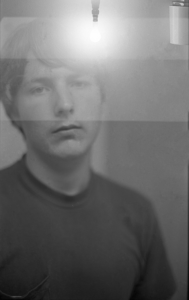
Self portrait as a teenage boy. Memory is a slippery thing. It flows around moments in life in a stream, conforming to the needs of the moment. One of my abiding interests is pictures and how they work, and it’s a cliché to refer to images as aide-mémoire. A better description, from John Willats, is that pictures are props in a game of make believe. Photographs present an interesting puzzle because they usually bear an indexical relation with reality, pointing at a set of relationships in a specific moment. It is in this sense, and this sense only, that photographs can be said to be “truth,” or better, “proof.” I took this picture of myself, shortly after I started making photographs as a part of my life. I can narrow down the date between February and June 1975 because it was taken with a camera borrowed from school. I have a journal that recorded that I purchased my first camera in June of 1975. This was not taken by that camera.

I was fascinated with the multiplicity of ways that photographs could be manipulated, and was trying to experiment with multiple exposures by winding the film back and exposing it. Of course, I screwed it up and didn’t recognize that you had to move the film an exact amount and keep the camera oriented in the same direction. The upside down lightbulb near my head is the result. Although this strip of photographs is manipulated, there are some interesting bits to me that reach back to some deeper memories about who this person is that I am looking at. It seems like it’s many lifetimes ago.

Most people probably won’t notice the two deodorant sticks in the headboard behind me. Bakersfield was a hot place, and it seemed like no amount of attention would stop me from stinking like a pig. That was a different me; it’s either a change in latitude or body chemistry, but BO has become a lesser concern. I am, however, still a book piler. I have lots of them, and they seem to grow even after I try to resolve and put things away. This photograph was the only one I printed at the time, as I recall. I liked the glowing flare spot by my head. I was a sucker for things that hinted at dreams and dreaming. Maybe it was just the dirty brown reality of the valley that made me so hungry for a way out. I’m a bit nostalgic for the row of books on the other side.

I was a proud member of the classics book club. I remember reading Plato’s Republic, lots of plays by Sophocles, and so on though I suspect I really didn’t understand as much of it as I thought I did. Zooming in on the spines of the books I see lots of works of environmental activism, Carlos Casteneda, plenty of almanacs and such. There were fewer screens, and they held a lot less information. Books and magazines were the main way to fuel a dream. That, and music.

It has been over a year since I last wrote anything here. It has been a long time since I last thought of dreams, and wondered what I wanted out of life. Too many rocks to wrap the memories around, too many lifetimes both real and imagined to dwell in any one place too long. I remember the advice that Marylyn Parins once gave me, regarding grasping literature and literary history. Sometimes you have to dive in the middle and swim both ways.

Dab

It surprised me to hear that dab was a printing term associated with stereotyping. I also found it strange that it would be associated with dance move, or internet meme, or drug use.

Dab entered the English language around 1300, with no known origin, both as a verb and a noun. It started as a slap, a light blow,  also used figuratively as in “poking fun” at someone. In the 18th century, it was associated with soft substances, though I suspect they weren’t talking about Brylcreem. It also meant to apply just a small amount. An obsolete sense used in typeseting meant inserting a wooden type ornament into soft metal to cast it in more durable form.

Incised printing, in some forms of engraving and photogravure, has some dynamic range in that deep channels in the plate can hold more ink and thus print darker, making them somewhat analog in that degrees of gradation are possible. Texture is given primarily through the use of patterns of stippled dots, like grains, or lines arranged in parallel a bit like grain in wood to increase the surface area which would hold ink in its recesses increasing density.

Relief printing, as in woodcut or typeset text has two states: ink or no ink. Relief printing is a digital process. A small amount of ink is dabbed or rolled on the surface of the plate; too much ink and the plate is unintelligible. Grain isn’t a factor in woodcuts, as the wood is oriented with its grain perpendicular to the impression for maximum strength and the ability to hold fine detail. Line and and stipple are also used for much the same fashion as in burin engraving on metal, but without the same sense of depth and range because of the increased saturation, rather than density, of ink.

Historically, the wood used for woodcuts comes from boxwood, the same popular topiary shrub seen everywhere today. Needless to say, there are distinct limitations to materials used in reproductive technologies. Boxwood is slow growing, and almost never reaches beyond 3-4 inches in diameter. Pieces are cut into cross grain disks of the same height as the metal type to be used, and in order to make larger illustrations, multiple pieces are carved separately and clamped together in the press. In the 19th century, this was actually useful because labor could be divided between several journeymen to make plates quickly instead of the laborious, sometimes multi-year procedures associated with burin engraving.

Carving against the grain has some disadvantages. Wood grain behaves like a cluster of straws, soaking up liquid and swelling to weaken it. Thus, stereotyping for larger production runs was a necessity, not an option. At the turn of the 18th century, though, smaller publics and lower production made the production of elegant artistic works possible, like Thomas Bewick’s A General History of the Quadropeds from 1790.

The Giraffe, or Cameleopard

Accuracy in reporting wasn’t really an issue for most early instances of visual communication. There was big money circulating in print, mostly for publishers, and a large pool of journeyman able to churn out words and images. Illustrated newspapers were a big success by the middle of the nineteenth century. But there were a variety of competitors in the race to pander to, as well as create, a public taste in visual representations. The invention of photography in 1839 did not revolutionize or overthrow existing print regimes. Photographs were often raw material for engravings, discarded after sketches or engravings from them had been created.

One of the major markets for publishers was reproductions of popular works of art. Henri Delaborde, writing in 1856, saw little future for photography as a useful tool for this:

In reproducing art, it is the inevitable inability to discriminate between what should be transcribed and what should be interpreted, that is the fatal disability which will eternally condemn photography to an industrial role that is beneath and outside the bounds of art. Photography can but parody the appearance of its subjects. Printmaking manages to seize its intimate appearance. Nowadays we are inclined to content ourselves with inanimate reproductions. Nothing more. Should this be sufficient for us? Have we lost our appreciation of art because of our sudden interest in a new discovery?

It seems odd that the lines, crosshatches, and stipples of early printing processes would be be preferred to smooth gradations of tone provided by silver or platinum grains clumped at the papers surface. There were limitations, to be sure— largely due to the lack of color processes— but interpretations of artworks were more prized than accurate reproductions. For a time, relief prints, intaglio prints, and photographs all competed for the same sector of the art market: reproductions of paintings. For news, there was simply no competition for woodcut printing. Photographs were used to provide an index to appearances, but the report was created by a committee of artisans. William Ivins identified this cultural phenomena, in his final remarks in 1953:

In a way, my whole argument about the role of the exactly repeatable pictorial statement and its syntaxes resolves itself into what, once stated, is the truism that at any given moment the accepted report of an event is of greater importance than the event, for what we think about and act upon is the symbolic report and not the concrete event itself. (180)

The market for images demanded, rather than depth and accuracy, a human interpretation of whatever event was being reported. This was slow to shift. Taste did not begin to shift until after one more revolution in print culture, lithography. It was lithography that put art in everyone’s home. The ascendency of photography was slow, and only really took off when it lost its subtle gradations as it was digitized into halftone dots.

The emphasis on the human touch in the 18th and 19th century, perhaps even into the 20th reflects real concerns about the nature of perception and the imperfections of technology. It seems entirely fitting that Bewick, the pioneering woodcut artist, used a carving of his thumbprint as a signature. Curiously, in the slang of 20th century noir, a fingerprint is a dab.

A leather dabber for distributing ink on plates

Incision

There are two fundamental ways that humans have made their marks upon the world. One is by depositing pigment on surfaces, the other is incision, carving or impressing lines and shapes into objects. One requires two dimensions, the other three or even four. An incised line can appear or seemingly disappear through the motion of light across a surface, subject to motion of the light or the observer.

An incision can be decoded in at least three ways. Is the key information on the surface, or in the depths, or both? When applied to reproductive technologies, it’s generally an either/or decision. The end product is primarily the transfer of pigment to a flat surface, so ink is applied either to the high spots (as in linocut, woodcut, or movable type) or to the depths as in intaglio printing (engraving). Paper may be embossed or ink left raised in an impression, but this is a secondary characteristic, meant more for touch rather than symbolic use. Braille is of course a notable exception to this generality. Primarily, though, symbolic exchange is usually reducible to a two dimensional domain, with a third element being syntax—the sequence which symbols occur, either in space or time.

I have been revisiting Stephen Bann’s Parallel Lines (2001) for its trenchant critique of Walter Benjamin’s “The Work of Art in the Age of Mechanical Reproduction” (1936-39) and William Ivins Prints and Visual Communication (1953). Bann argues that Benjamin and Ivins leapt over the cultural context of burin engraving (specifically in 19th century France) to make broad statements about reproductive technologies that are misleading at best in their effort to crown photography as the logical culmination of the search for meaningful communication in the visual realm. Ivin’s declaration that photography presented “images devoid of syntax” has always struck me as particularly ludicrous, but coming back around to these books after a decade or so has brought new thoughts.

Bann argues that photography and printmaking developed along parallel lines, with practitioners sometimes crossing between technologies for a variety of reasons. Bann’s examination is crucial to me because for a brief span, the reproduction of images and words occurred on a parallel track of a different sort: words were reproduced through movable type, a relief printing method where the raised parts of a plate are inked. Woodcuts could be reproduced in the same fashion, but engraving brought entirely new challenges. Because engravings are incised, with ink pressed into the impressed spaces, they could not be printed using the same presses. Word and image had been divorced, cut apart by technological divergence. I’m not sure they have ever reconciled.

Books using engraved plates for illustration generally group the plates in separate sections, or exist as separate volumes from typeset texts. In fact, it was possible to buy the illustrations separately and combine them with print and have them custom bound together, making each copy of a book unique. Each illustration also represented a division of labor, because the designer of the image and the artist engraving the plate might also be different people, with different aesthetic senses.

This plate, for example, was inserted into an 1811 copy of Thomas Aikenside’s Pleasures of the Imagination. The image credits are T. Stothard del (delineavit- artist) and I. Neagle sculp (sculpsit- engraver). In a direct way, this is the syntax of engraving— there are two credits, always poised on the left and right in the same places, because there are two labors involved with separate conventions. It’s convention, more than syntax, that William Ivins names as the syntax of the image. Syntax is generally defined as sequence or arrangement, but Ivin’s use of syntax points to conventions, conventions that are more recognizable as transformation or translation between the planar media of painting and drawing and the incised medium, engraving.

What makes a visual expression valuable? In Marxist terms, that would be it’s exchange value. Walter Benjamin suggests that in the arts, this amounts to exhibition value, where rather than being a small scale object viewed by the few (cult value) it becomes a reproduced object viewed by the many. Stephen Bann points instead to a concept from Michael Baxandall, troc, which is the French word for barter (1985, ch. 4). Baxandall, in a chapter delineating the relationship between Picasso and his dealers and art critics of the day, defines it as a sort of syntax for visual expression which guided the way his works were created and distributed. “Market” is not the correct term:

But it must also be said at once that the relation is much more diffuse than the economists’. In the economists’ market what the producer is compensated by is money: money goes one way, goods or services the other. But in the relation between painters and cultures the currency is much more diverse than just money: it includes such things as approval, intellectual nurture and, later, reassurance, provocation and irritation of stimulating kinds, the articulation of ideas, vernacular visual skills, friendship and — very important indeed — a history of one’s activity and a heredity, as well as sometimes money acting both as a token of some of these and a means to continuing performance. And the good exchanged for these is not so much pictures as profitable and pleasurable experience of pictures.

Without suggesting that Picasso modified his art to accommodate market conditions, it isn’t a stretch to say that he sought approval. Human marking activities are intentional, and those intentions are not strictly a personal matter—there is a social currency that motivates them, rewards them or ignores them. Reproductive print culture changes the flow of information in dramatic ways, not simply because of the loss of cult status but because of entirely new social conditions directing them. Baxandall compares painting to the work of a bridge builder, who is constrained both by the structural character of his materials and the proclivities of those who have commissioned the structure and would like to consider it “beautiful.”

The material constraints of incised artwork are many. Burin engraving, in particular, is unforgiving and laborious. Once removed, material can’t really be replaced. The division of labor between designer and etcher was a necessity, particularly later in the nineteenth century when images were valued for their news value; burin engraving was wholly unsuited to this. Acid resist etching was far more popular, particularly in England, because instead of abrading the plate it was painted or drawn upon with resist material and later etched to incise the surface. Creating texture, or indistinct lines, was challenging.

Joseph Viscomi’s landmark Blake and the Idea of the Book (1993) offers an excellent peek into the practicalities of etching and the cultural context of reproduction in the 18th and 19th centuries. Illuminated printmaking, Blake’s “infernal method,” was marshaled against the division of labor then prevalent in visual reproduction:

In Illuminated printmaking, the labor of the artist (delineavit) and engraver (sculpsit) is the same labor, occurring in the same place and at the same time. This relation conceiving and making, between invention and execution, is encouraged by the very act of drawing as opposed to tracing and/or translating designs already drawn and thus composed. (32)

Drawing directly on the plates (including lettering all the text in handwriting) was the way that Blake composed all his major works. Only one book, juvenilia published by friends, was printed using a conventional letterpress. Consequently, the conventions of drawing are crucial to understanding how/why he was obscure in his own time and largely ignored. Viscomi compares and contrasts Blake’s extant writings about drawing with selected drawing textbooks, some of which he seemed to follow and others he chafed at, as well as various developments in printmaking that sought to bring it into alignment (at least in appearance) with contemporary trends in drawing.

This is only one side of the equation of troc. The other side, that of critical reception, is beautifully illustrated by an excerpt from Blake’s letter to the Monthly Magazine (1806) in response to the harsh criticism leveled at Henry Fuseli’s depiction of Count Ugolino.

Mr. Fuseli’s Count Ugolino is the father of sons of feeling and dignity who would not sit looking in their parent’s face in the moment of his agony but would rather die in secret, while they suffer him to indulge his passionate and innocent grief, his innocent and venerable madness, and insanity, and fury, and whatever paltry critics cannot, because they dare not, look upon.

The implication that the critic simply didn’t look at Fuseli’s work. “Under pretense of fair criticism and candor, the most wretched taste ever upheld for many, very many years.” Blakes backlash against connoisseurship speaks directly to the emergent “syntax” by which visual arts were being formed and judged in the 18th and 19th centuries

The taste of English amateurs has been too much formed upon pictures imported from Flanders and Holland; consequently our countrymen are easily brow-beat on the subject of painting; and hence it is so common to hear a man say, “I am no judge of pictures:” but, O Englishmen! know that every man ought to be a judge of pictures, and every man is so who has not been connoisseured out of his senses.

A gentleman who visited me the other day, said, “I am very much surprised at the dislike that some connoisseurs shew on viewing the pictures of Mr. Fuseli; but the truth is, he is a hundred years beyond the present generation.” Though I am startled at such an assertion, I hope the contemporary taste will shorten the hundred years into as many hours; for I am sure that any person consulting his own eyes must prefer what is so supereminent; and I am as sure that any person consulting his own reputation, or the reputation of his country, will refrain from disgracing either by such ill-judged criticisms in future.

The hope that people wouldn’t be “connoisseured” out of their senses is strong in both Ivins and Benjamin; Benjamin actually suggests that the mass taste was progressing faster in motion pictures than anywhere else, with a more prodigious appetite for advanced art forms. It remains that we always judge new art using the yardstick of the old, and while some “syntax,” or circumstances for troc, disappear others appear.  Blake may have been able to overcome the division of labor in printing, but he could not change prevailing taste.

It has always been one of the primary tasks of art to create a demand whose hour of full satisfaction has not yet come. The history of every art form has critical periods in which the particular form strains after effects which can only be easily achieved with a changed technical standard that is to say, in a new art form. (Benjamin 266)

Benjamin’s sentiment, derived from Andre Breton, is much in evidence in Blake’s response. However, the conditions for communication will always be social and therefore political. Photography is not immune. There is a reason that Henry Fox Talbot called it photogenic drawing. Photography did not settle deep debates over taste, it merely complicated them.

A Spurious Result

Thomas Ruff, jpeg kj01

The working definition of artifact I’ve been comfortable with lately is an object embedded in a tradition or social structure that gives it meaning. Walter Benjamin argued that one of the things being altered about artifacts in the age of reproducibility is that they are loosing the aura that surrounds them because of the irrelevance of authenticity. There are no originals, only copies that have surrendered their claim to uniqueness in pursuit of universality. They lose their fetish cult value, but still participate in social structures in new ways.

Thomas Ruff’s JPEG work demonstrates this. Immaterial objects that exist only as clusters of electrons on a screen provide new social effects brought about through increased connectivity. The drive for universality continues.

I find it interesting that Ruff’s series arises, in a sense, from a group of failures (disasters, both natural and unnatural) juxtaposed with idyls (his word), or natural and man made landscapes depicted in the same digitally disintegrated form. He suggests that the focus on disaster is autobiographical, arising from an attempt to make sense of the collapse of the twin towers on 9/11/2001. He was in NYC at the time, and his camera failure  (or x-ray damage at the airport) left him searching the internet for images to make sense of the disaster.

His career-long focus on the structure of photographic images as they change with technology lead him to consider the pixel, rather than silver grains, as a fundamental constituent of images. Further, the internet has altered the image through compression. The artifacted image, then, is a product of both a reduced “sampling rate” of reality, related as “painterly squares” but further altered by losses when compressed images are reintegrated as viewable artifacts. This presents artifact in different light.

Research into the term in the OED has brought some new perspective. Artifact is of relatively recent pedigree, defined in the 17th century as “An object made or modified by human workmanship, as opposed to one formed by natural processes.” The Latin etymology from ars factum (object made with skill) is amazingly direct and similar in meaning and spelling across several languages. However, in the 19th century there was a reversal of this meaning:

A spurious result, effect, or finding in a scientific experiment or investigation, esp. one created by the experimental technique or procedure itself. Also as a mass noun: such effects collectively.

The alteration of usage shifts, perhaps with the trends in shifting technologies and techniques. Artifacts have been wrenched from human hands and rendered procedural. But the human touch lingers, in its third sense, an ideological manifestation: “A non-material human construct.” The citation of this usage from Toynbee’s Study of History from 1934 is particularly telling:

It is a mere accident that the material tools which Man has made for himself should have a greater capacity to survive than Man’s psychic artifacts.

Toynbee’s psychic artifacts like the concept of an internal and external proletariat have completely faded, including his suggestion that civilizations disappear through disintegration. Recall that disintegration is ultimately what Thomas Ruff’s JPEG work places firmly in the field of view. Ruff suggests that with adequate distance these artifact filled JPEG images integrate themselves into natural images. Viewed up close, their disintegration can be beautiful.

What procedural tool, then, creates the appearance of these images? The short answer is “lossy compression,” but the longer answer has some important clues. From Wikipedia:

JPEG uses a lossy form of compression based on the discrete cosine transform (DCT). This mathematical operation converts each frame/field of the video source from the spatial (2D) domain into the frequency domain (a.k.a. transform domain). A perceptual model based loosely on the human psychovisual system discards high-frequency information, i.e. sharp transitions in intensity, and color hue. In the transform domain, the process of reducing information is called quantization.

The images are transformed using an algorithm created from a perceptual model. The information discarded in the compression is forever lost. In short, we trust a machine (computer) to shape our images, using a model based on our perception. The information we view has a diminishing relationship with any sort of material object, rather, it comes from our artificially created intelligence of our own visual system. This takes artifice to an entirely new level.

The “skill” introduced into the ars factum— the artifact— is that of a machine. We are in effect, creating human/machine hybrid perceptions that are becoming the cornerstones of our epistemological universe. These new truths are not completely man made. It’s not just AI and robots that will alter the future, it’s a thousand choices along the way based on spurious information untouched by human hands.

It remains startling to me how relevant Walter Benjamin remains in all this.

Theses defining the developmental tendencies of art can therefore contribute to the political struggle in ways that it would be a mistake to underestimate. They neutralize a number of traditional concepts—such as creativity and genius, eternal value and mystery— which, used in an uncontrolled way (and controlling them is difficult today), allow factual material to be manipulated in the interests of fascism. (252)

Benjamin goes on to argue that his “politics of art” would be useless for fascism. I think he’s wrong. Machine manipulation is nothing if not the new mystery. Reproducibility through algorithms has reinforced what is worst in us in the last decade or more.

The Work of Art

Woodstock, ME © 2017 Jeff Ward

Taking an obscure route across Maine, when we turned the corner near Woodstock I wasn’t expecting to find an oversized sculpture of a hand cranked telephone. Just what use is that? But there is a value to it, I think. Art, according to most, is defined by its lack of utility, its uselessness. Economic theories generally don’t have much to say about Art, nonetheless people who make it are constantly in search of a way to find some sort of livelihood. The exchange value of art seems impossible to predict, caught up in arbitrary social fashions.

Tolstoy’s fourfold division of labor has a place for it, as “mental labor” alongside science. Reflecting on this grouping, it dawns on me that in their purest forms, both art and science aim at an increase in understanding. This piece fulfills that criteria, in that I was moved to pull of the road and read the placard which explains that the last magneto telephone system was operated here.

Not all art is this easy. Accepting that the purpose of art is to increase understanding and that it is necessary human work has deepened my understanding of Walter Benjamin’s canonical essay “The Work of Art in the Age of its Mechanical Reproducibility” (1936-39). I’ve read it hundreds of times, researched its context, even delivered papers on it, but this time it’s different. It’s like turning a corner and finding a new perspective.

There are some useful concepts in the essay that I always come back to, i.e. the aura and learning through distraction, not to mention the shift between cult value and exhibition value, but concentrating on these is a bit like focusing on the steps of a ladder without understanding where the ladder is climbing to. Film is central to Benjamin’s dissection of reproducible art, as is photography, but the core structure is built around the struggle between capitalism, marxism, and fascism.

My obsession with photography and film wasn’t my first technological obsession. I was eleven when I watched the moon landing on T.V. and long before that I had read Thirty Seconds Over Tokyo at least 40 times; I didn’t even know there was a movie version. It was a firsthand account of a pivotal point in World War II, of the first bombing raid on Tokyo and his subsequent crash and escape in mainland China. I poured over that book as a kid. Of course it’s filled with patriotic enthusiasm, but it was also filled with human struggle and vivid detail. Remembering it has made the conclusion of Benjamin’s essay ring louder:

“Fiat ars—pereat mundus,” says fascism [Let art florish—and the world pass away] expecting from war, as Marinetti admits, the artistic gratification of a sense perception altered by technology. This is evidently the consummation of l’art pour l’art. Humankind, which once, in Homer, was an object of contemplation for the Olympian gods, has now become one for itself. Its self-alienation has reached the point where it can experience its own annihilation as a supreme aesthetic pleasure. Such is the aestheticizing of politics, as practiced by fascism. Communism replies by politicizing art. ( 270)

The last two sentences, offered with emphasis in the original, have long seemed enigmatic to me. Aestheticized politics is easy enough, as every war narrative easily attests, but politicized art is not so simple; one can easily envision communist posters, but since they often depict armed revolutionary struggle, it’s hard to see much difference.

It suddenly dawned on me that politicizing does not necessarily entail sloganeering and jingoism. I think what Benjamin really meant here is that proletarianization, coupled with the shifting nature of reproducible art should lead to an increased consciousness of the body politic. Remember that the root of politics is polis (city) and by creating a mass of people, art with a mass appeal is political. The entire sweep of the essay marks the shifting valuation and potential for art as a mass phenomenon, i.e. the work of art.

Part of the confusion about this essay is reflected in the permutations of its translated titles. It was first published in english as “The Work of Art in the Age of Mechanical Reproduction,” a variant that enables the reading of work as a verb— i.e. what does Art do— a reading supported by the concluding paragraph. However, recent scholars have translated it as “The Work of Art in the Age of its Mechanical Reproducibility,” privileging the nominal form, a reading which emphasizes the idea of an original art object that is being reproduced. There is support in the text for this as well, particularly in its treatment of cult value, and the function of architecture as art. I hadn’t really considered the janus face of work in this context before now.

Throughout, what Benjamin offers is a social theory of value in art that works in concert with Marx’s social theory of value. Modern reproducible forms alter our perceptions and our social behavior in dramatic ways by creating new pathways and functions, not simply new forms for art.

As I turned to drive away from Gil Whitman’s telephone sculpture, a different scene unfolded.

Woodstock, ME © 2017 Jeff Ward

The Glad Game

Littleton, NH © 2017 Jeff Ward

It’s been hard to see a bright side to alienation / estrangement / detachment as I write my way through theoretical issues mired in them: a slough of despond, indeed. When I passed through Littleton, NH in 2017, it was by choice. It had a bit of the character of a pilgrimage, for multiple reasons. I had no idea, however, that it was the birthplace of Eleanor Porter, creator of Pollyanna

Pollyanna was the instigator of “the glad game,” a game in which the player is tasked with finding the bright side of any situation. In the novel, it’s origin was a particular Christmas where Pollyanna had wished for a doll, but instead received a pair of crutches.

“Goosey! Why, just be glad because you don’t—NEED—’EM!” exulted Pollyanna, triumphantly. “You see it’s just as easy—when you know how!” (5)

I went to Littleton, NH, largely because it was the home of Benjamin W. Kilburn, one of the largest stereograph manufacturers of the late 19th century. There’s not really a trace of him there, that I saw– they are much more proud of Pollyanna. It’s just as well, at this stage I really wasn’t looking for anything.

But there was another reason: it was around ten years after Victoria Mikelonis, one of my favorite teachers at the University of Minnesota had passed away. I only took one class from her on theories of metaphor, and it was the most intense and rewarding experience that I had in grad school. On of my last memories of her was stopping by her office and talking, excitedly, about Kilburn and stereographs. She told me she had recently visited a granddaughter who lived in Littleton, and raved about what a nice place it was. Vicki was one of the few people who was always cheerful, always looking on the bright side, and above all always engaged with the world and the ideas around her.

Dr. Mikelonis was primarily engaged with working with women in Poland and the Ukraine, training them to be technical communicators using a wide variety of pedagogical strategies– cross cultural communication would be another way of labeling it. That’s where her research interest in metaphor, schemas and ontologies came from. How do we know things? How do we learn things? These are the questions that animated her.

She was living with cancer, and like Ian Dury, the man who gave us reasons to be cheerful, she also died from it. The class is burned on my memory; it was dense and rewarding. We began with short papers by Max Black and others in philosophy of language, and worked our way through Paul Ricoeur’s Rule of Metaphor. The basic plan began with a word level examination of metaphor, through sentences into larger schema in Hesse & Arbib’s The Construction of Reality. The capstone essay was Nietzsche’s On Truth and Lies, with its oft quoted maxim regarding truth:

A mobile army of metaphors, metonyms, and anthropomorphisms—in short, a sum of human relations which have been enhanced, transposed, and embellished poetically and rhetorically, and which after long use seem firm, canonical, and obligatory to a people: truths are illusions about which one has forgotten that this is what they are; metaphors which are worn out and without sensuous power; coins which have lost their pictures and now matter only as metal, no longer as coins.

Pollyanna is a metonym for someone with irrepressible optimism, and as the 1913 novel and its Disney movie treatment fade, the word substitutes for an idea, a moment of illusion celebrated in a statue. In the mountains above Littleton, in Franconia another anthropomorphic image drew great excitement.

B.W. Kilburn and others did a brisk trade in stereographs of the old man of the mountain. The White Mountains are one of America’s oldest tourist destinations, and where there are tourists there is a market for souvenirs. A shared experience of a rock, a unique bit of sublime America, drew most of the great writers and statesmen to the the small towns scattered along the edge of wildness, to gather and be glad.

Postcard c.1955

Philosopher Patrick Maynard built a strong case that photographs are props in a game of make-believe, and like metaphors they allow for a form of transport to places we have or haven’t been. Thomas Southall’s essay “White Mountain Stereographs and the Development of a Collective Vision” further suggests that what was developing during Kilburn’s time was set of practices that contributed to a particular truth of shared experience. Photographers were encouraged to alter the landscape to reinforce the “glad game” of seeing awesome nature in a collective way. Southall cites Kentucky photographer James Mullen at the 1873 meeting of the National Photographic Association:

And let me advise you here to always have with you on your photographic trips a spade and a good axe, the latter particularly will often be found a ‘friend in need’ when it is desirable to cut a small tree or remove a branch that would otherwise obscure some important point of your view. (101-102)

Human intervention to stabilize an agreed upon truth operates in predictable ways. We chip away at the rough edges of truth, shaping it to fit what we need at the time. There’s a selective, arbitrary, and culturally driven need to reshape the world for our purposes. In the 1920s chains were brought in to hold the face of the old man of the mountain together, and later cement and other prosthetics.

The old man’s face collapsed in 2003: nature injects its own arbitrary elements. People still make the pilgrimage to the White Mountains above Littleton, NH, and the souvenir vendors still do a brisk business.

The truth is out there.

Time and Love

Sally Mann What Remains: The Life and Work of Sally Mann was coincident with her exhibition/meditation on death.   Her choice of terms for corpses, “carapaces,” jibes with my experience: when I touched the body of my father, my first thought was “this isn’t my father.” The shell felt somehow plastic, although important to others. For me, it meant nothing. Mann says for her “what remains is time and love.” But if love remains, how is love manifest? Lately, I believe the essence of love can be found in our daily meals— the moments when we stop and sustain our bodies.

As the holiday season approaches, it seems important to note that most key social celebrations are built around feast (or fast) days. It’s where we find the intersection of past and present in its most poignant form. A photograph, as an aide–mémoire, is quite thin. In a recent talk, Sally Mann suggested that Proust never could have written A Remembrance of Things Past triggered by a photograph. To remember, it takes the engagement of more senses. For Proust, it was a madeline.  A photograph can evoke, but its affect is a surface one. Again, her use of “thin” seems apt. To stir our entire being, it takes something more than a breeze brushing across the skin, or the decayed bones of a dead pet. To really feel alive and connected to our fellows, both past and present, a meal is almost always called for.

Cooking is a craft, at times celebrated and at other times dismissed as secondary to more ambitious pursuits, “mere cookery” as Plato would have it. A meal is an opportunity, and for most, an opportunity lost, for reflecting and connecting with what it really means to be mortal. I started a recording my meals a few years ago, inspired partly by Jaques Pepin.

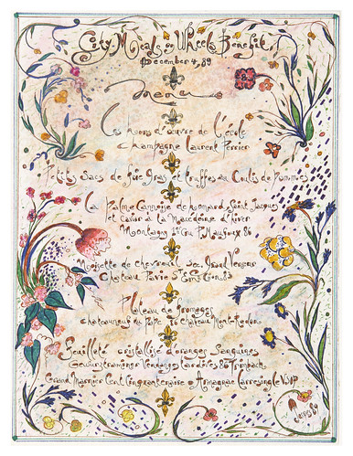
Jacques Pépin's Artwork

I lack the talent to draw or even hand letter menus; my experiment consists of a pedestrian list in a google document. But it started to matter to me. I liked being able to see what I used to eat. It didn’t start out as an artistic, or even poetic practice, however. It was more accurately a byproduct of reading The Good Life by Helen and Scott Nearing. They recommended keeping basic records of consumption in order to better manage one’s household, and meals are indeed a part of that. It seemed hardly surprising that Sally and Larry Mann also were moved by the Nearings, at least according to her recent Q&A. The “love” part, so apparent in Pepin’s menus, exists, albeit thinly, even in something as simple as a list of the food consumed over a period of time.

Going through my mother’s things after her death, I was always struck by the incredible number of small bits of paper with “lists” on them, listing when flowers bloomed, when relatives visited, etc. She wrote it all down increasingly as she got older. I am reminded that the origin of civilization comes down to us through time as pedestrian lists of cellar and larder inventories. If what remains is “time and love” then these records, strange as they may seem, carry with them a kernel, a seed of the human condition.

As the contentious election heated up this year, my compulsion to keep some sort of record of what was “good” about life became stronger. My wife has long kept photo sets of things that made her happy, but I’ve been disillusioned by photography these last few years. Although I dedicated most of my life to it, it just didn’t seem to be a repository of joy for me. I’ve found a way to recover just a bit of that though by photographing my meals. To combat the constant stream of political memes coming my way, I started posting those photographs to Facebook. I was surprised at the response. It seems that lots of people like food, especially in troubling times.

These photographs, for me, are simply an extension of the lists. I don’t look upon it as an aesthetic exercise at all, though I do try to capture what’s significant about the colors and textures of the food. When Lloyd Bitzer died a few days ago, I began to examine why I like taking these pictures from a different angle. Bitzer was a rhetorical scholar whose signature essay, “The Rhetorical Situation” occupied a significant part of my time in graduate school. Thinking my way through those concepts, hashed out so long ago, has brought into focus why I think of meals (not photographs of meals) as an important thing to remember, and to think deeply about.

In a grossly simplified version, Bitzer might argue that meals are a reaction to the exigence of hunger; his critic Richard Vatz might respond that we also eat as a response to being persuaded that we are hungry, while Barbara Biesecker would suggest that both of these responses deny and obscure the potential for radical transformation that occurs at every mealtime. Skipping past the Derridian doublespeak, Biesecker’s point is well placed: we don’t simply eat to satisfy a need, or eat because we’re convinced to, we eat because every time we eat we are changed by it.  In turn, by exercising control over what we eat we can indeed change ourselves, with time and love.

Each meal has the potential to be a uniquely kairotic moment (last supper?). Every meal presents the opportunity to change the world, and ourselves, simply by appreciating were we are at that particular moment. Such moments, when one recognizes the potential for love and sharing, can be radically transformative. The world can be made better by understanding the complexity of our place within it.